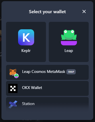
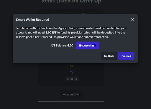
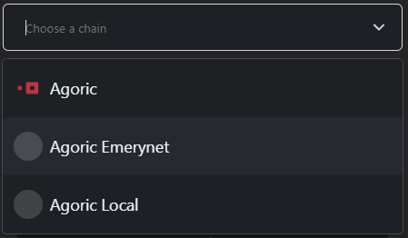
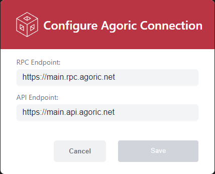
You'll find a collection of ready-to-use or pre-coded user interface elements that help accelerate your Agoric Dapp-building. These pre-designed elements include wallet connect buttons, chain selector, node selector, amount input and wallet provisioning. Utilization of these building blocks ensures best practices in design and accessibility.
Installation and Setup
See Introduction to Agoric UI Kit for installation and setup how-to.
Once complete you'll need to run this yarn command:
yarn add @agoric/react-componentsUI Components List
Before getting started, there are some resources you might want to keep handy in case you get stuck, have questions, or are curious about any of the components. Getting in contact with us is easy!
- Connect Wallet
- Wallet Provisioning
- Amount Input
- Chain Selector
- Node Selector
Connect Wallet

- Connecting with Wallet Connect Button
- Connecting without Wallet Connect Button
- Using a Custom Chain Provider
Customizable Parameters
| Parameter | Type | Description |
|---|---|---|
| ClassName | string | CSS class name for the underlying <button> element |
Wallet Provisioning

See AgoricProviderLite component -> provisionNoticeContent prop:
Customizable Parameters
| Parameter | Type | Description |
|---|---|---|
| provisionNoticeContent | undefined | (fee?: bigint) => JSX.Element |
Amount Input
Customizable Parameters
| Parameter | Type | Description |
|---|---|---|
| value | bigint | null |
| decimalPlace | number | The number of decimal places used for displaying the denominated value |
| className | string | undefined |
| onChange | undefined | (value: bigint) => void |
| disabled | boolean | undefined |
Chain Selector

Customizable Parameters
| Parameter | Type | Description |
|---|---|---|
| networkConfigs | NetworkConfig[] | The list of Agoric network configs to choose from. |
| label | ChangeChainCombobox[‘label’] | See ChangeChainCombobox |
| size | ChangeChainCombobox[‘size’] | See ChangeChainCombobox |
| appearance | ChangeChainCombobox[‘appearance’] | See ChangeChainCombobox |
| maxHeight | ChangeChainCombobox[‘maxHeight’] | See ChangeChainCombobox |
Node Selector

Customizable Parameters
| Parameter | Type | Description |
|---|---|---|
| isOpen | boolean | undefined |
| onClose | () => void | Triggered when the user tries to close the modal |